Nick's Sandwich
Savor simplicity — a dedicated online ordering platform streamlining food delivery with easy customization and complete, accurate menu options.
Full case study · 6 min read
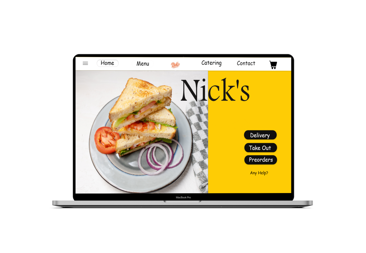
An independent home for a beloved sandwich shop
Nick's Sandwich Shop, a well-loved sandwich store in California, approached me to redesign their online ordering platform — improving user experience, reducing order errors, and providing a seamless delivery and pick-up process. Customers had grown frustrated with third-party delivery platforms, citing missing customization options, outdated menu listings, and frequent order errors.
Problem statement
Busy users don't have much time to order and wait for delivery. Many sandwich lovers wanted an independent website for Nick's, since existing delivery platforms were causing problems — and those platforms weren't showing the up-to-date options actually available in-store.
Solution
Design a dedicated website for Nick's Sandwich with full customization options and an easy navigation flow — including everything available in-store that wasn't showing up on other delivery sites, so customers can order their favorites without any hassle.
The goal
Create a website and app that let users order food online with an easy, frictionless flow.
Responsibilities: interviews, paper & digital wireframing, low- and high-fidelity prototyping, usability studies, accessibility.
What busy customers actually need
I conducted user interviews and turned them into an empathy map to better understand target users and their needs. Many wanted an individual website for this shop — like Subway or Jimmy John's have — since no such site existed, and available listings didn't show accurate availability or updated sandwich info. The biggest frustration centered on delivery options.
"I'm always on the go and need to quickly find what I want to order." · "I hate when I can't customize my order." · "I want clear pictures of the sandwiches and ingredients." · "I prefer having delivery or pick-up to fit my schedule."
"I hope I can find what I'm looking for without searching the entire site." · "I don't have time to deal with technical or delivery issues." · "I hope I can customize orders to fit my dietary needs."
Impatient when the site is slow. Frustrated when customization is limited. Happy when they find things quickly. Relieved when delivery or pick-up is easy to schedule.
Scans the site for their sandwich. Clicks the photo to see it up close. Customizes their order if possible. Checks for delivery/pick-up. Leaves if the site doesn't meet their needs.
Meet Stefani

Stefani
Software Engineer · Age 30 · 2 childrenA busy parent who wants reliable food delivery to her location, and would love an independent delivery website for her favorite sandwich shop.
Frustration: she ordered from two different apps and websites and got the wrong delivery both times. After looking into it, she learned it was a third-party service-provider issue, not the shop's fault.
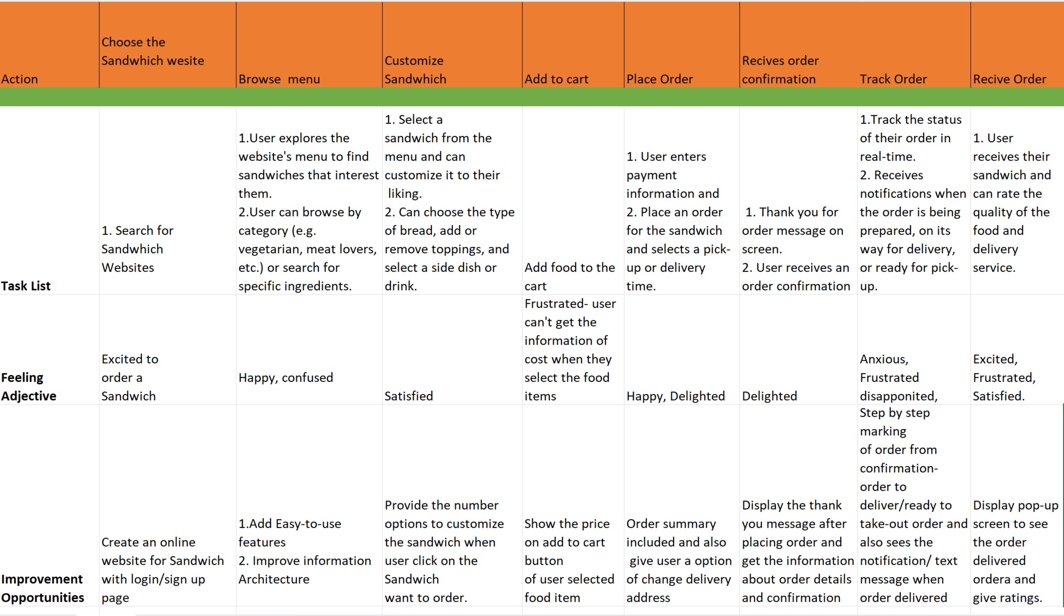
User journey map
From structure to screen
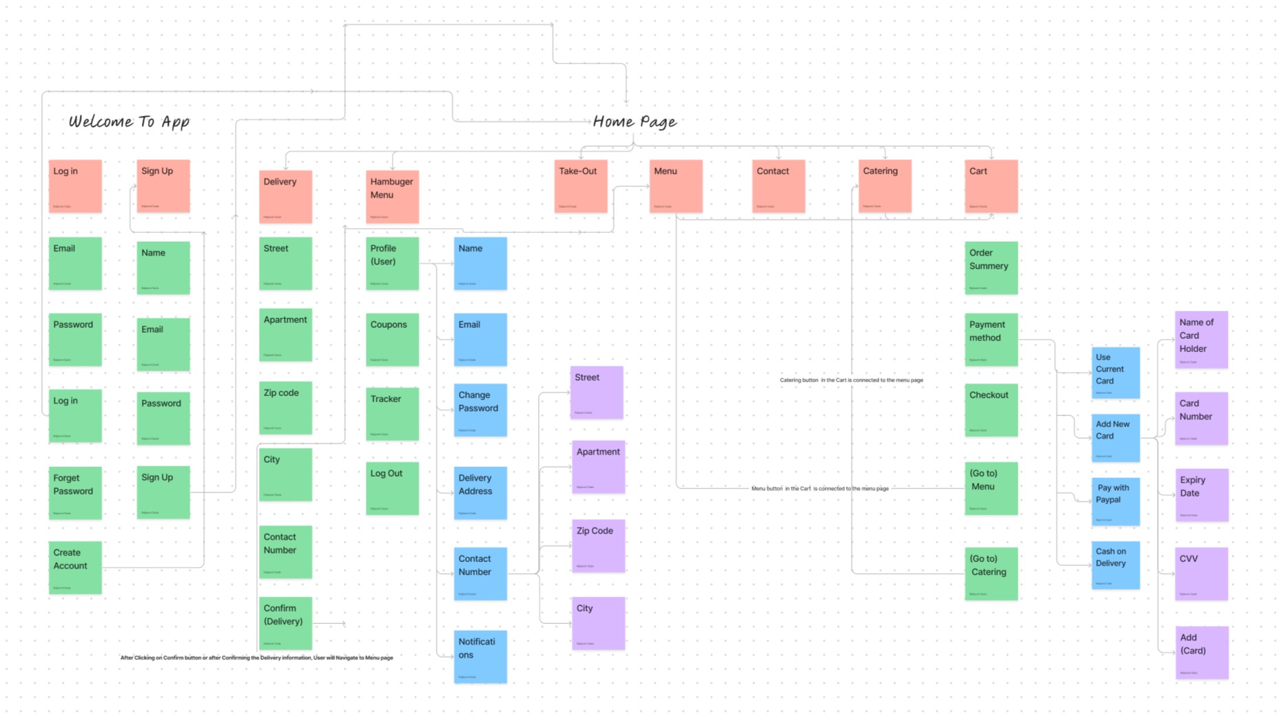
Information architecture
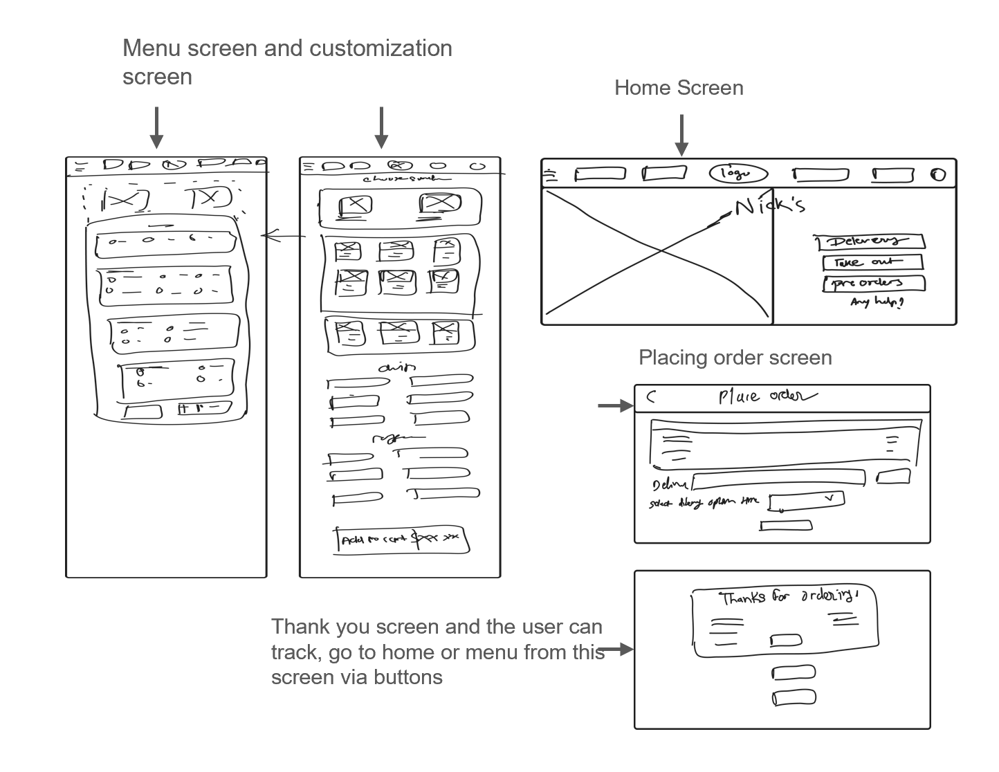
Sketches
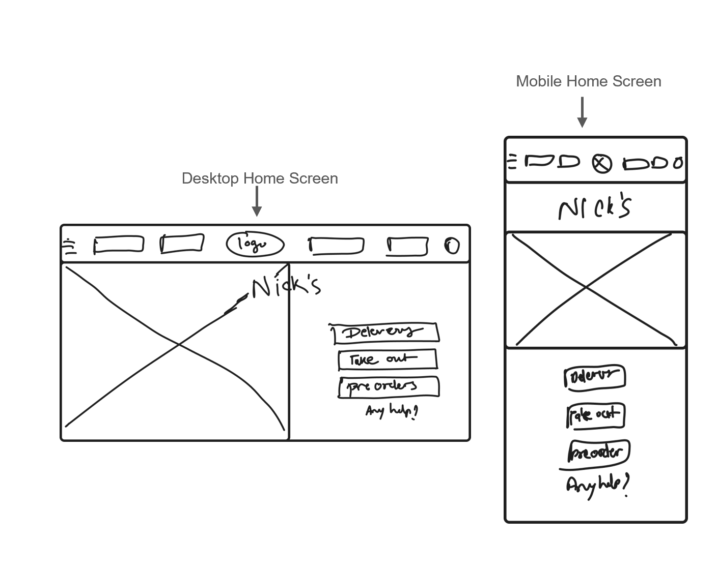
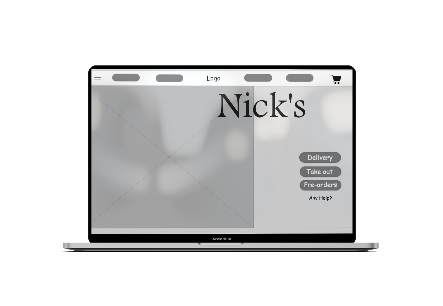
Digital wireframe
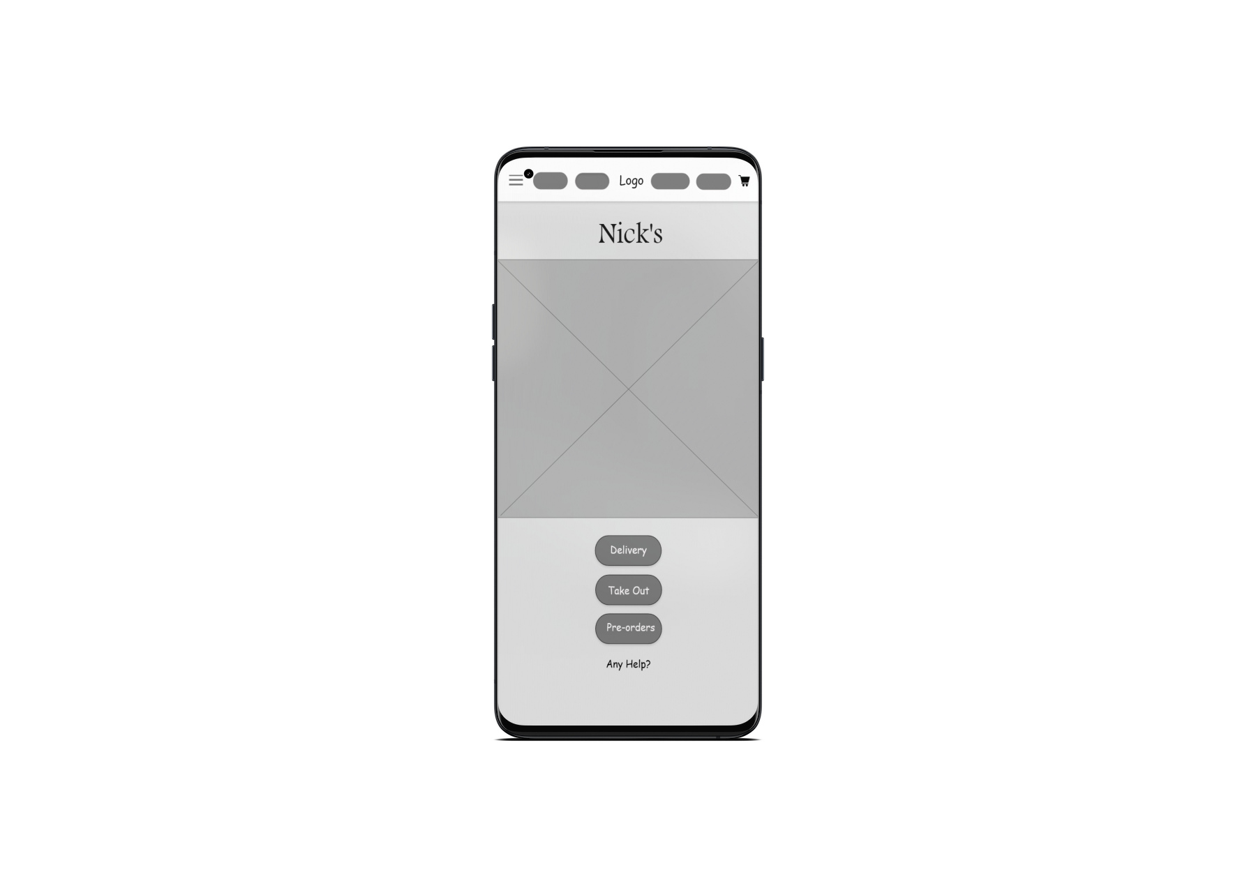
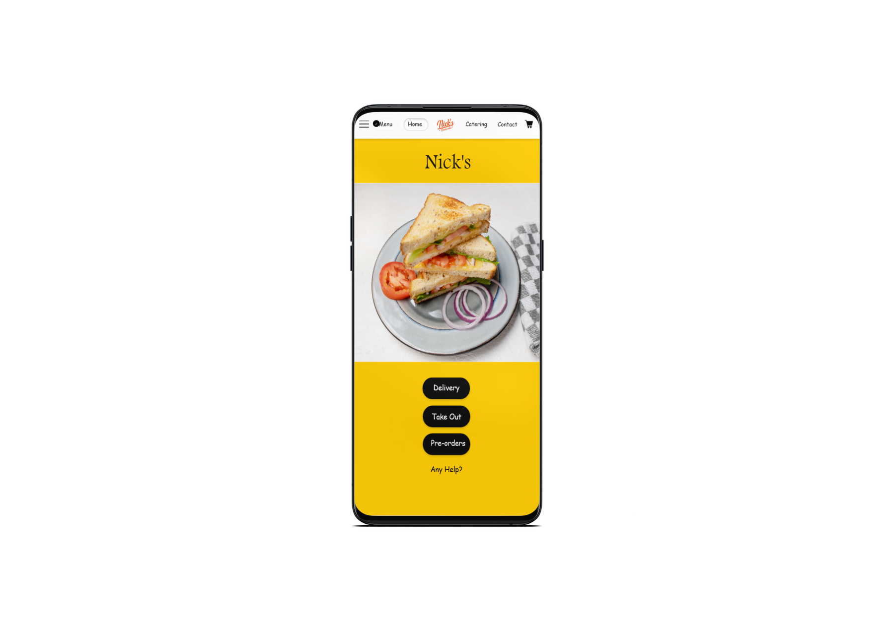
Responsive across devices
Because users shop from a variety of devices, I optimized the browsing experience across mobile and tablet sizes for the smoothest experience possible.
Two flows that needed fixing
Place-order page
After payment, users landed on a confirmation page with no way back. They told us they were unable to return to the previous page.
Edit option in user profile
Users found it difficult to edit their personal information and delivery details — the client didn't want an edit/change button for every single field. Based on feedback, I gave users more freedom to go back from the place-order page, without needing to edit every field individually in their profile.
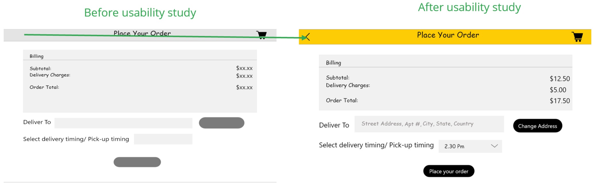
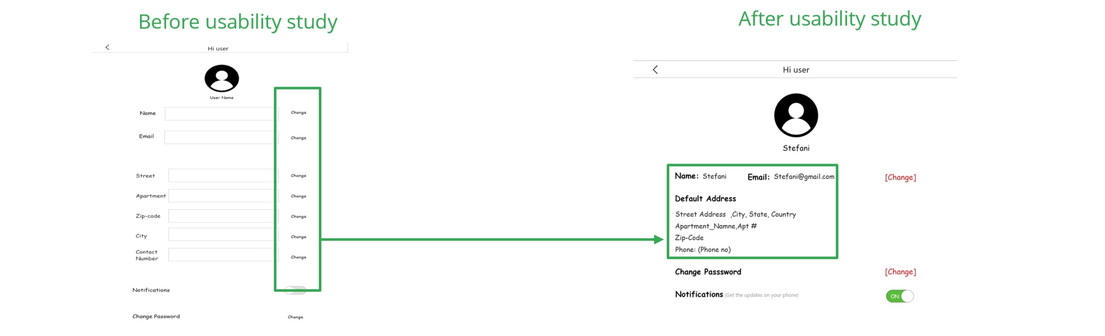
Based on the usability study, I improved the flow across both the place-order page and the profile page so users were never stuck without a way back.
Home, menu, customization, checkout
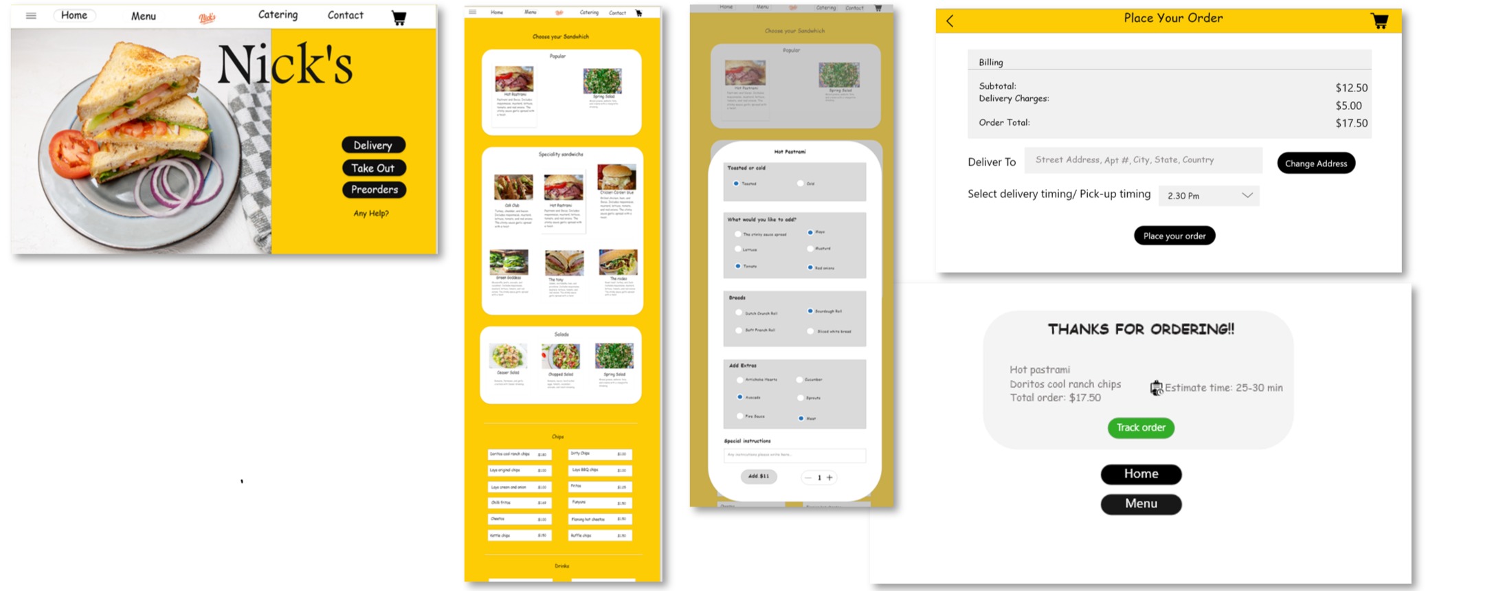
A visual hierarchy users understood
Based on user feedback, the redesigned app was easy to navigate and understand. During usability testing, as I iterated on the mockups, users expressed satisfaction with the changes and the visual hierarchy came through clearly.
Even a small design change can have a huge impact on user experience — iteration is what makes the difference.