NetVista
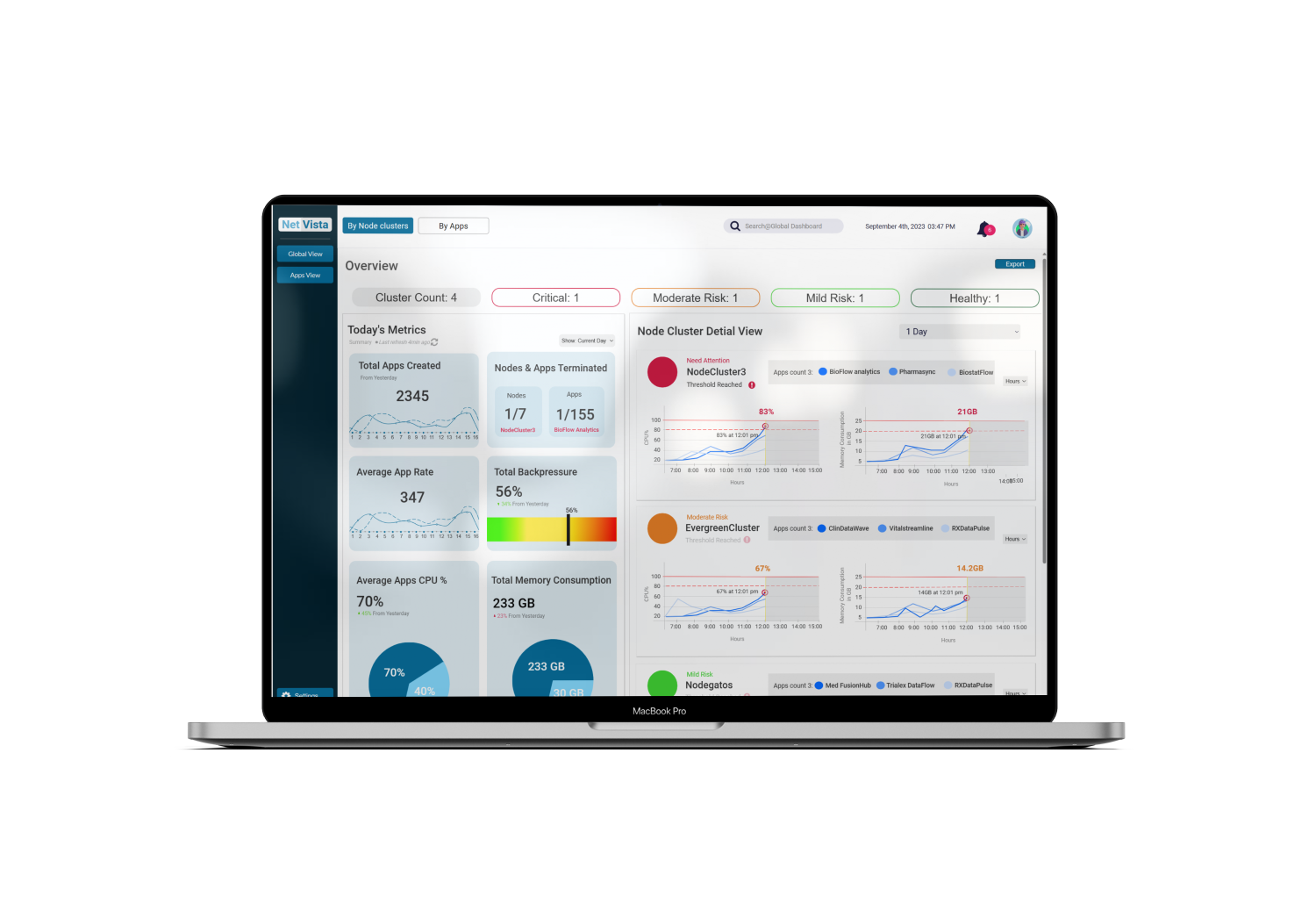
A unified real-time dashboard for data excellence — stay ahead of the curve with health and performance monitoring built for data engineers.
Full case study · 7 min read
What the dashboard needed to solve
Objectives
Deliver actionable, real-time data visualizations.
Enable rapid decision-making with a unified global and local view.
Empower data engineers to prioritize critical tasks.
Challenges
Complex monitoring — overwhelming data streams make it hard to isolate issues.
Delayed alerts — traditional tools lead to slow responses.
Information overload — unfiltered data obscures key metrics, with limited customization to match individual needs.
Meet John Davis, Data Engineer

John Davis
Data EngineerExperience: BS/MS in Computer Science & Information Systems, 5+ years as a data engineer, fluent in SQL/NoSQL, data pipelines, warehouses, ML, cloud services, and scripting.
Motivations: deliver value to the company, improve operational efficiency, ensure data consistency and security, minimize time & cost on pipelines, automate repetitive tasks, and uplevel the business with new technology.
User pain points
Benchmarking the industry
To understand industry benchmarks and gaps, I ran a competitor analysis of leading data-integration platforms.
Opportunity: design a solution that integrates real-time analytics, anomaly detection, and user customization into one intuitive dashboard.
My approach for the global dashboard
Determine the aggregate health of all apps in the production environment. Enhance system reliability, minimize downtime, and prioritize critical tasks. Comprehensive visualizations highlight apps not meeting checkpoints, surface which apps carry the most lag, and enable preventive action or debugging.
Conceptual model
Breaking the information-heavy content down into simpler navigational attributes.
Grounded in visualization theory
Applied Ben Shneiderman's visualization theory: more effective detection of faulty or missing data and anomalies; deeper analyses that produce more profound insights; and richer understanding that lets engineers ask bolder questions.
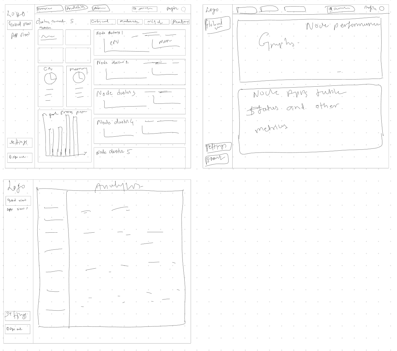
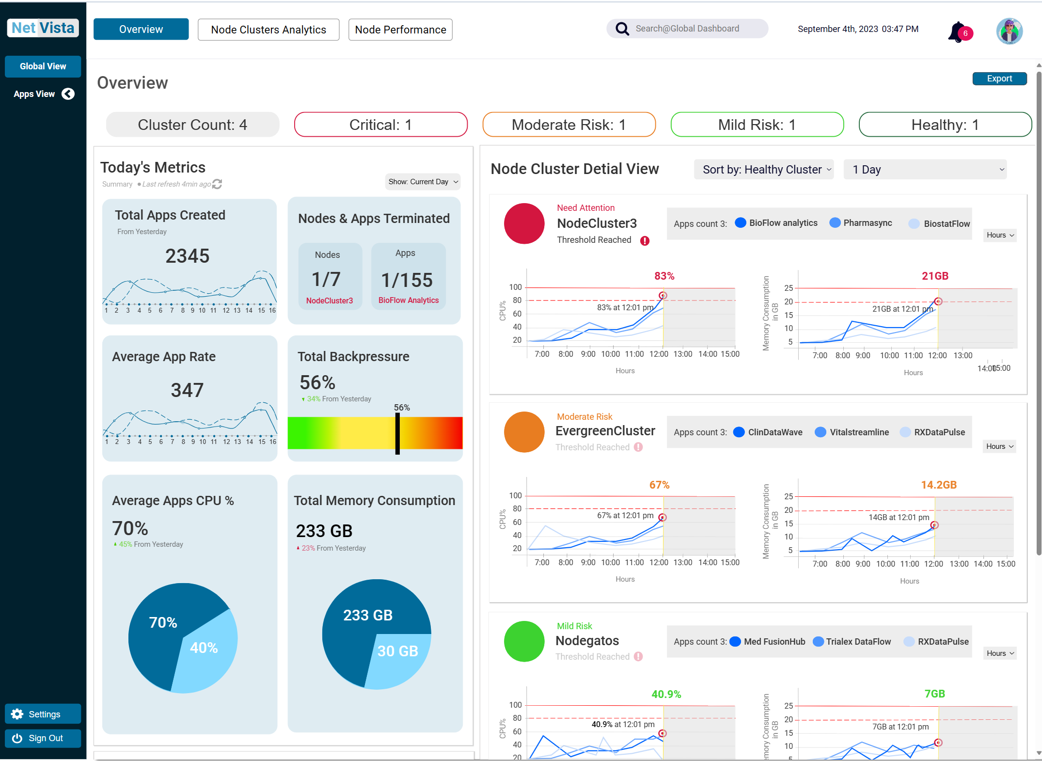
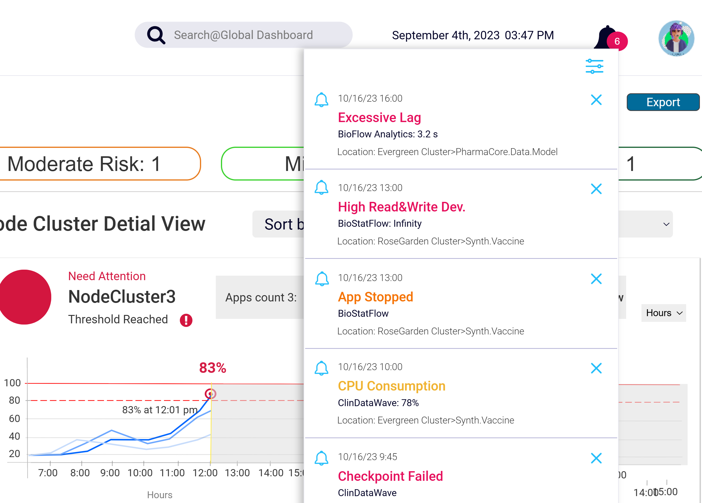
Overview of key metrics and KPIs in a digestible, comprehensible format — charts, graphs, and visual aids tuned to the needs of data engineers.
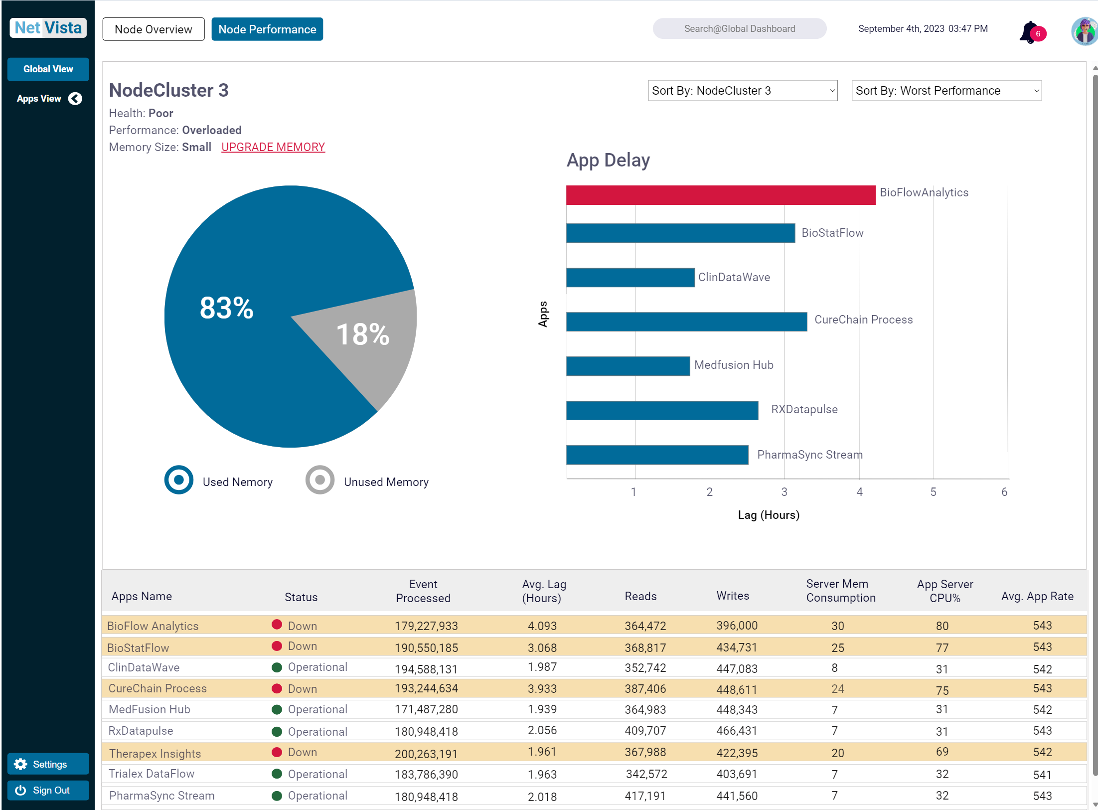
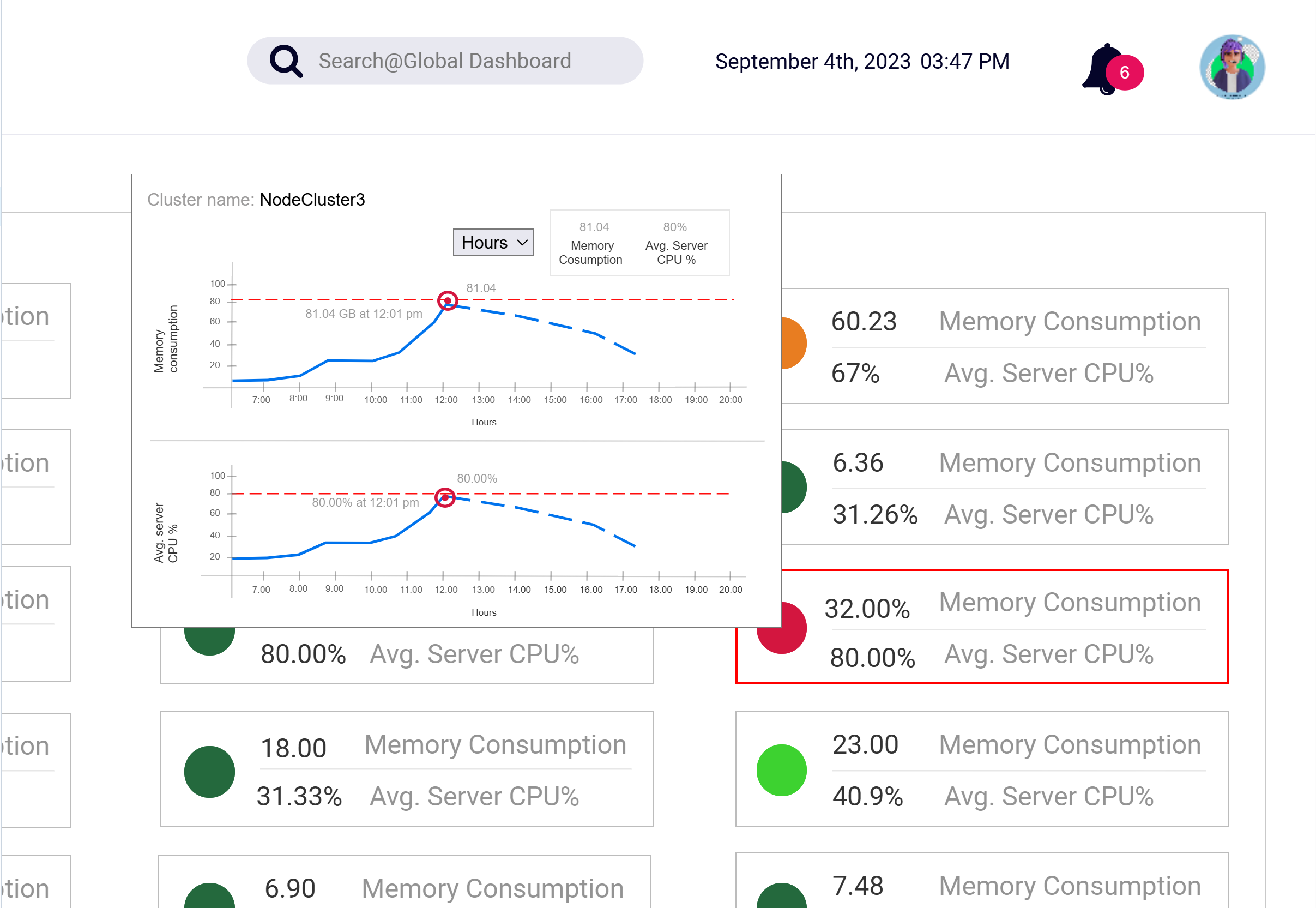
Node cluster performance uses physical, labeled controls (buttons, sliders) instead of complex syntax — with flexible sort menus for identifying environments and nodes across multiple apps.
Results that mattered to the team
The intuitive dashboard not only streamlined system monitoring but also empowered data engineers to prevent performance bottlenecks before they escalated.
Lessons from the process
What I learned
Real-time insights are critical — instant alerts drive proactive decisions.
Balancing complexity with simplicity — a clear visual hierarchy enhances usability.
Customization is non-negotiable — users demand flexible dashboard layouts.
Future enhancements
AI-powered anomaly detection to predict failures before they happen.
Advanced customization so engineers can build personalized workflows.
Collaborative troubleshooting for better team visibility on shared problems.