EduSphere
Let's make e-learning interesting with AI-driven personalized learning, gamification, spaced repetition, and the Pomodoro technique.
Full case study · 8 min read
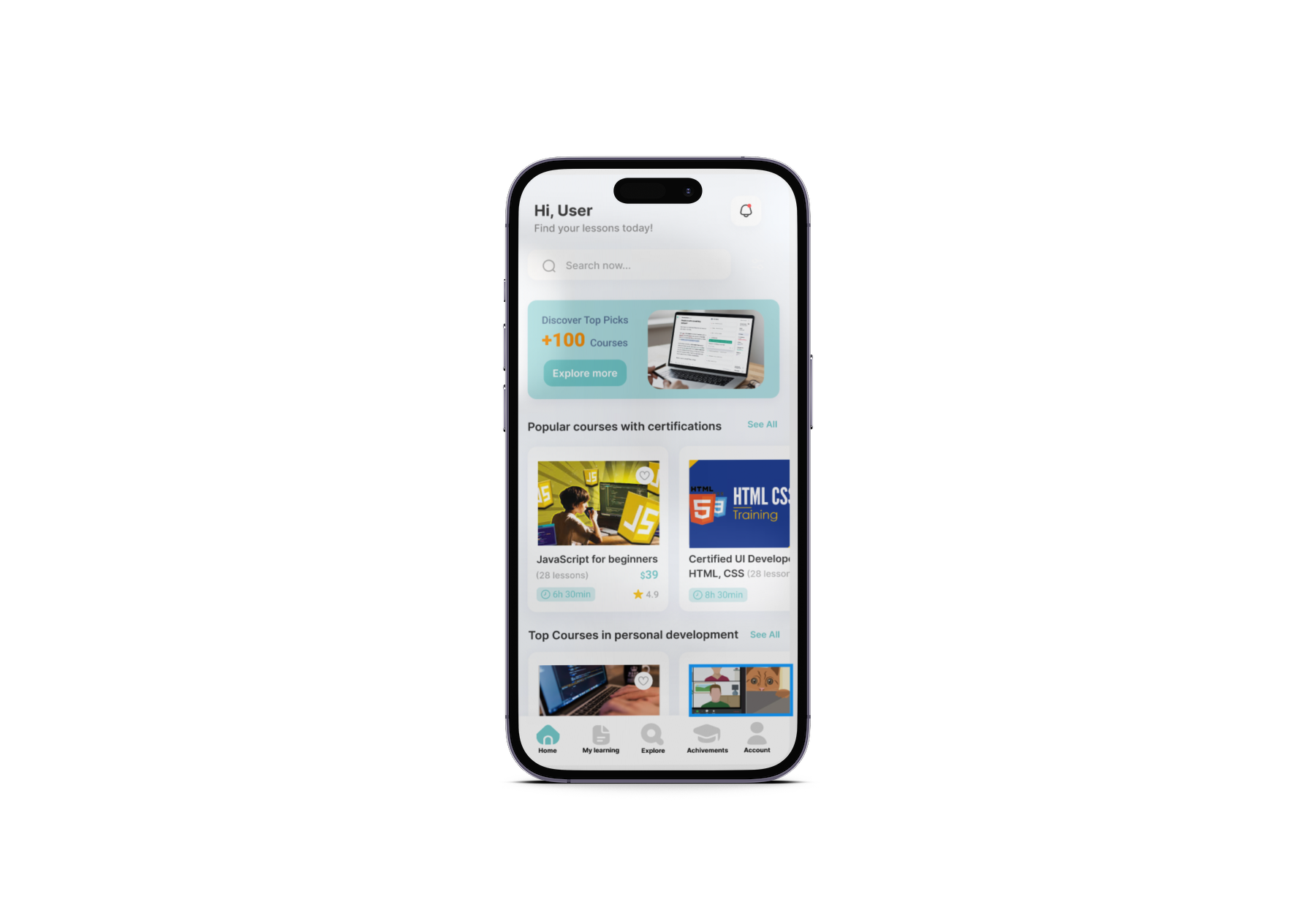
The learning dilemma: what's broken?
E-learning platforms have grown rapidly, but they still struggle with three key challenges that surfaced again and again in research.
Low engagement & motivation
Ineffective retention of information
Lack of personalized learning
The vision: making learning smarter & engaging
EduSphere was designed to bridge these gaps by integrating four techniques into one connected experience.
Research → Define → Ideate → Design → Test
Research
Survey + interviews to surface real pain points.
Define
Built a working persona from the research findings.
Ideate
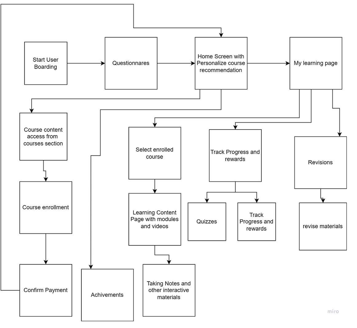
Mapped the user flow and sketched early concepts.
Design
Built high-fidelity mockups and interactive prototypes in Figma.
Test & iterate
Usability testing, then iterated on the design based on findings.
Understanding the users: what do they need?
Conducted user interviews (6 participants) and a survey (82 responses) to identify pain points.
6 participants — undergraduates, graduates, and postgraduates.
Meet Josh
Junior developer, age 24"I'm balancing work and learning. I need a flexible, engaging platform with progress tracking — I'm struggling with boring content and a lack of motivation."
User flow & feature prioritization
High-fidelity prototypes, built in Figma
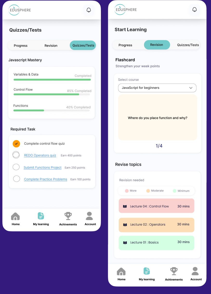
Solution 1 — Spaced repetition
AI tracks each learner's memory retention pattern and suggests the optimal interval for reviewing content — resurfacing material just before it's likely to be forgotten, via flashcards that adapt to topic difficulty.
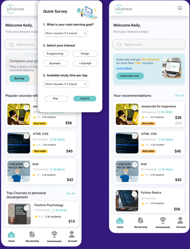
Solution 2 — Personalized learning
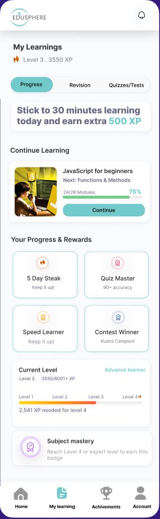
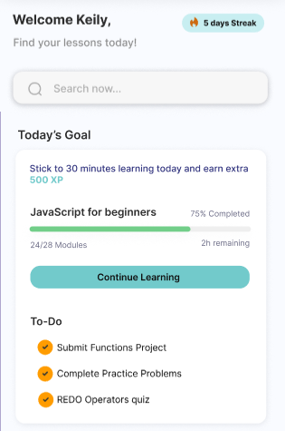
AI algorithms analyze a learner's profile, performance, and interests to suggest the most relevant courses or modules — reducing time spent searching and keeping learners focused on content that meets their needs.
Solution 3 — Gamification
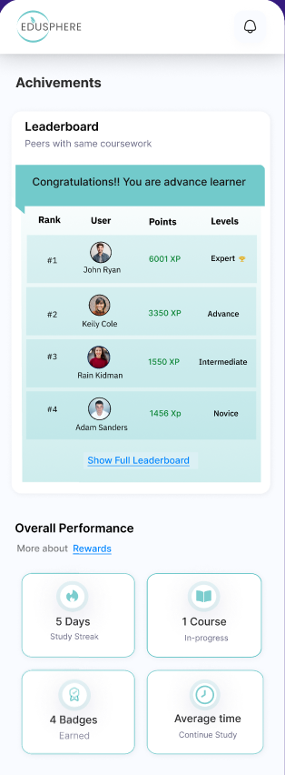
AI drives the back-end of gamification, adjusting the difficulty and type of challenges and rewards based on engagement and performance — including a leaderboard so learners can track their standing.
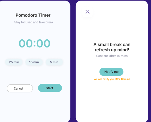
Solution 4 — Pomodoro technique
Users get frustrated and tired from lengthy videos. This technique lets students set 25, 15, or 5-minute intervals as needed and notifies them once they've hit their target, so they can take a proper rest.
Iterative feedback from usability testing (19 participants)
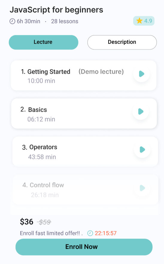
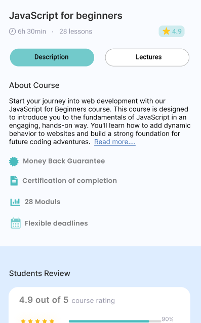
The lecture (curriculum) screen originally displayed before the course description. I rearranged the flow so the course description now appears first, giving learners an immediate understanding of the course before they explore the curriculum.
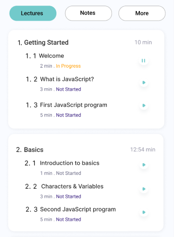
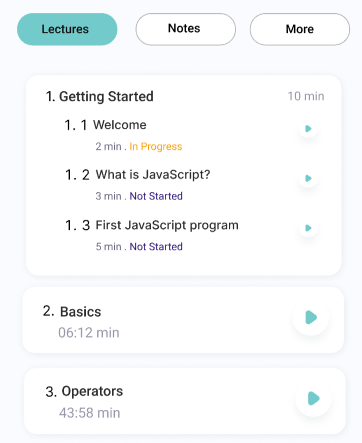
Users had to click repeatedly to expand each lecture or section after enrolling. I streamlined this by keeping sections open by default once a user enrolls, reducing unnecessary taps.
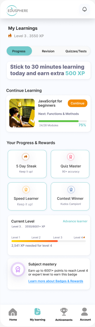
The meaning and criteria for earning Subject Mastery badges were unclear. I added detailed explanations plus a "Learn More" link to a dedicated page explaining rewards and badges in depth.
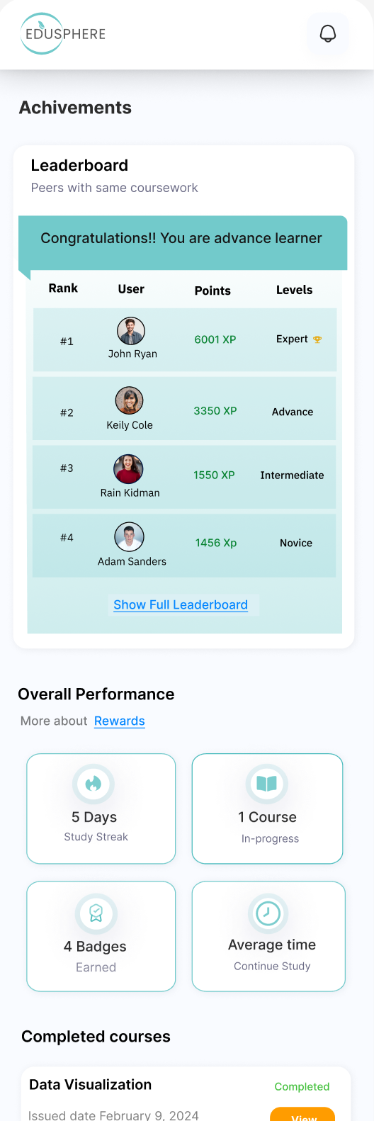
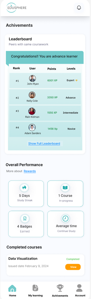
This section was motivating, but reward icons on the achievements page weren't prominent enough to quickly recognize accomplishments. I brightened and enhanced the icons for clearer, more immediate visual feedback.
Testing & insights: what worked, what didn't?
Key feedback & iterations
Improved visibility of badges & rewards
Reordered course descriptions before lessons
Clearer icons and leaderboard placement
Fixed minor design flaws surfaced in testing
Engaging, adaptive, retention-focused
EduSphere successfully enhances the e-learning experience by making it engaging, adaptive, and retention-focused.
- — Personalized features and gamification are essential for user satisfaction in e-learning.
- — Interactive content and diverse materials significantly improve engagement and motivation.
- — Usability matters: minor UI challenges surfaced, but overall satisfaction stayed high.
- — Future work: expanding AI capabilities and adding collaborative learning features.